The Power of Strategic Color Choices
If your room feels chaotic and disjointed, according to reports, the issue may lie in your color decisions. Design professionals emphasize that intentional color strategies can transform a disorganized space into a serene, well-designed environment that feels both calm and sophisticated.
As home design and DIY room makeovers continue to gain popularity, homeowners are increasingly investing in their living spaces. The good news is that achieving visual harmony doesn't require a complete overhaul—strategic color choices can create dramatic improvements through accessible, affordable upgrades.
Six Designer-Approved Color Strategies
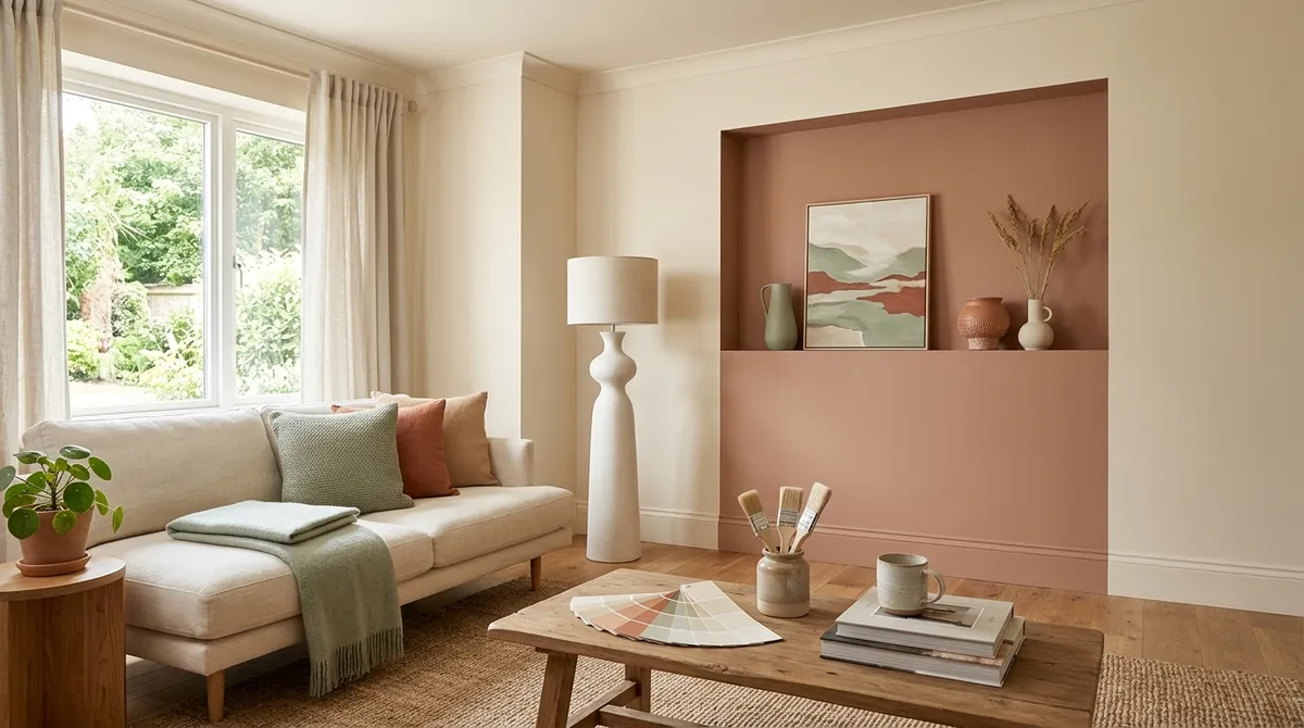
Make One Bold, Cohesive Color Decision
According to reports, designers recommend establishing a single, bold color choice as the foundation for your entire room. This cohesive approach creates a strong visual anchor that ties all elements together, preventing the scattered feeling that comes from too many competing colors.
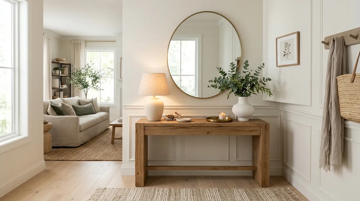
Establish a Neutral Base
Using a neutral base helps anchor the room and provides a calming backdrop for other design elements. This strategy allows you to introduce color through accessories and furnishings while maintaining an overall sense of balance and sophistication.
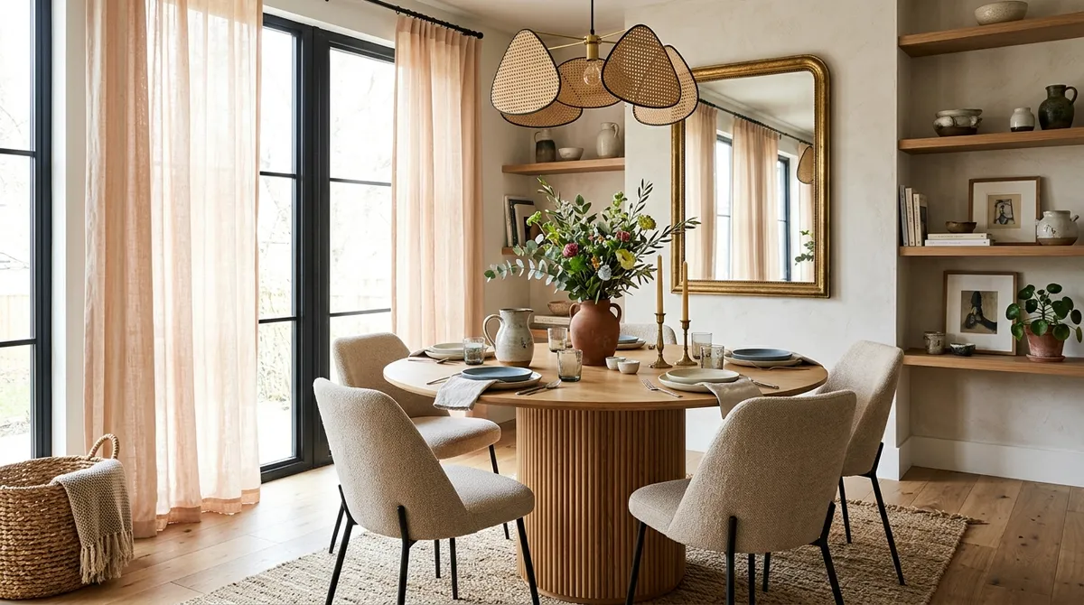
Limit Your Palette to 3-4 Complementary Colors
Reports indicate that restricting your color scheme to just three or four complementary colors prevents visual overwhelm. This limitation forces intentional choices and creates a more refined, professional-looking result that feels cohesive rather than chaotic.
Choose an Accent Wall Strategically
When implementing an accent wall, designers emphasize strategic placement. The right accent wall can create depth and visual interest while maintaining the room's overall harmony, but poor placement can disrupt the flow and add to visual chaos.
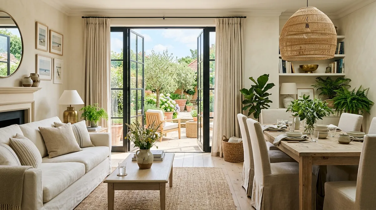
Match Trim and Ceiling Colors for Flow
According to reports, matching trim and ceiling colors creates seamless flow throughout the space. This technique eliminates visual breaks that can make a room feel choppy and disjointed, instead promoting a sense of continuity and calm.
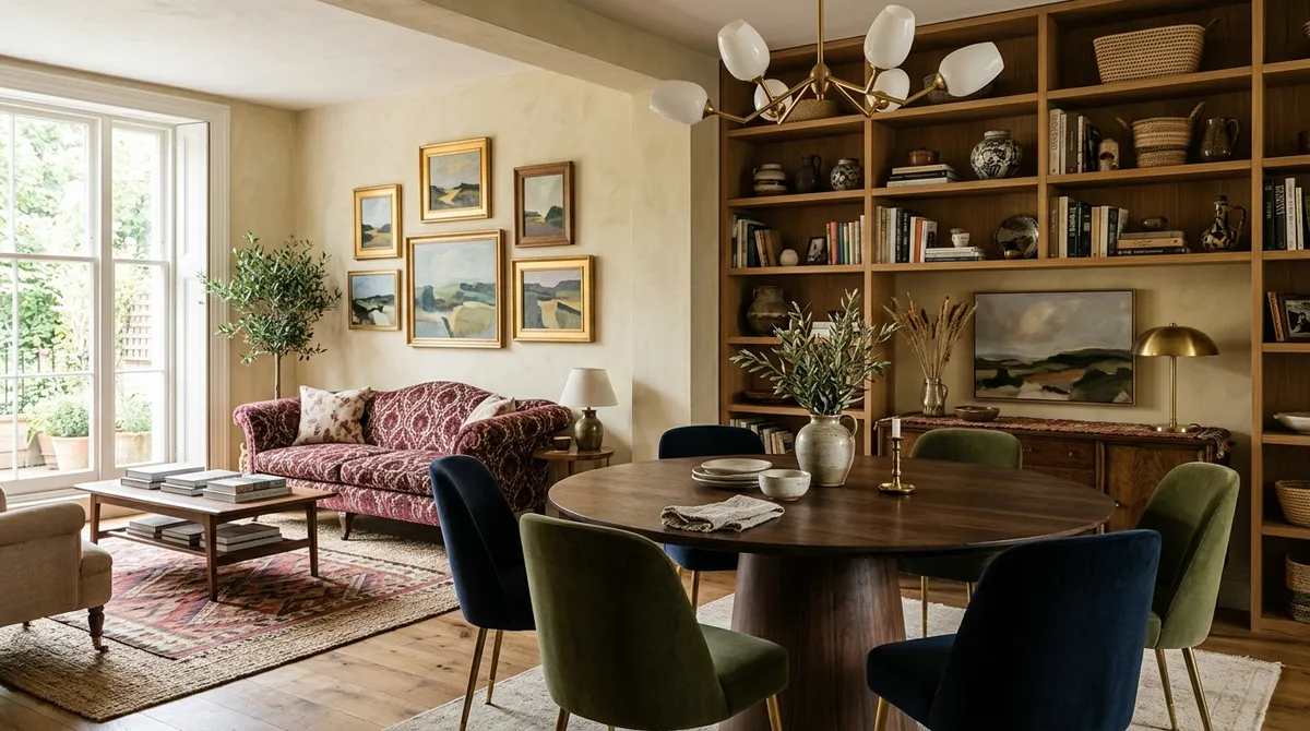
Layer Warm or Cool Tones Consistently
Consistent use of either warm or cool tones throughout the space creates psychological comfort. Reports suggest that mixing temperature families can create tension, while staying within one temperature range promotes the serene atmosphere most homeowners desire.
The Psychology Behind Color Harmony
The effectiveness of these strategies lies in color psychology and how our brains process visual information. According to reports, certain color combinations naturally feel "calm" while others create a "chaotic" sensation, making the difference between a restful retreat and an overstimulating environment.
Budget-Friendly Implementation
These color strategies can be implemented affordably through paint and strategic decor swaps. Rather than requiring expensive furniture or major renovations, most of these techniques can be achieved through thoughtful color planning and selective updates to existing spaces.
Making Design Accessible
Reports emphasize that these professional strategies make sophisticated design feel achievable for non-professionals. By following these six principles, homeowners can create spaces that rival professionally designed rooms without requiring extensive design knowledge or significant investment.
Common Color Mistakes to Avoid
While specific mistakes aren't detailed in available reports, the emphasis on these six strategies suggests that common issues include using too many competing colors, failing to establish a cohesive foundation, and neglecting the psychological impact of color temperature consistency.
Transforming Your Space
Implementing even one of these color principles can prove impactful for room transformation. The key lies in intentional decision-making rather than random color choices, creating spaces that feel both elevated and personally meaningful.
These designer-approved strategies offer a roadmap for anyone looking to create more harmonious living spaces through the power of thoughtful color decisions.